Giving scrappies time back to focus on what’s important to them
Buddy is the brainchild of a lifelong ‘scrappie’ (the preferred term for a scrap metal dealer) and his wife. For years, they felt that scrap was a forgotten industry—left behind by the tech revolution. Trading scrap was an outdated, time-consuming process. So, they developed a digital marketplace to connect scrappies with vetted top-tier buyers, making scrap trading simpler and more convenient for everyone involved. They needed a fresh, exciting brand identity and messaging to launch Buddy to the world and create hype and allure within a famously uninspiring industry.
Services
Brand Positioning
Messaging Framework
Brand Identity
Personality and Tone of Voice
Marketing + Brand Collateral
“The Lady Gaga of the metal recycling world.”
— Lisa
Strategy
Through research and interviews with key stakeholders, we learned that being a scrappie meant often sacrificing precious family and leisure time to an inefficient, unreliable industry filled with questionable practices and people. The fruits often weren’t worth the labour. We needed to convey that Buddy offers a better trading experience— one that scrappies can trust and feel confident in, that gives them back their time and saves them money and energy. This led us to our positioning:
Trade scrap, not time
Design
The Buddy team wanted to do something different and push boundaries. To bring their new positioning to life, we started with a simple custom wordmark that gave us scope to build with. We opted for a balance of strong and playful typography to represent Buddy’s personality and drew colour inspiration from oxidised metals—which are often found in scrap heaps—to develop a fresh and alluring brand identity.
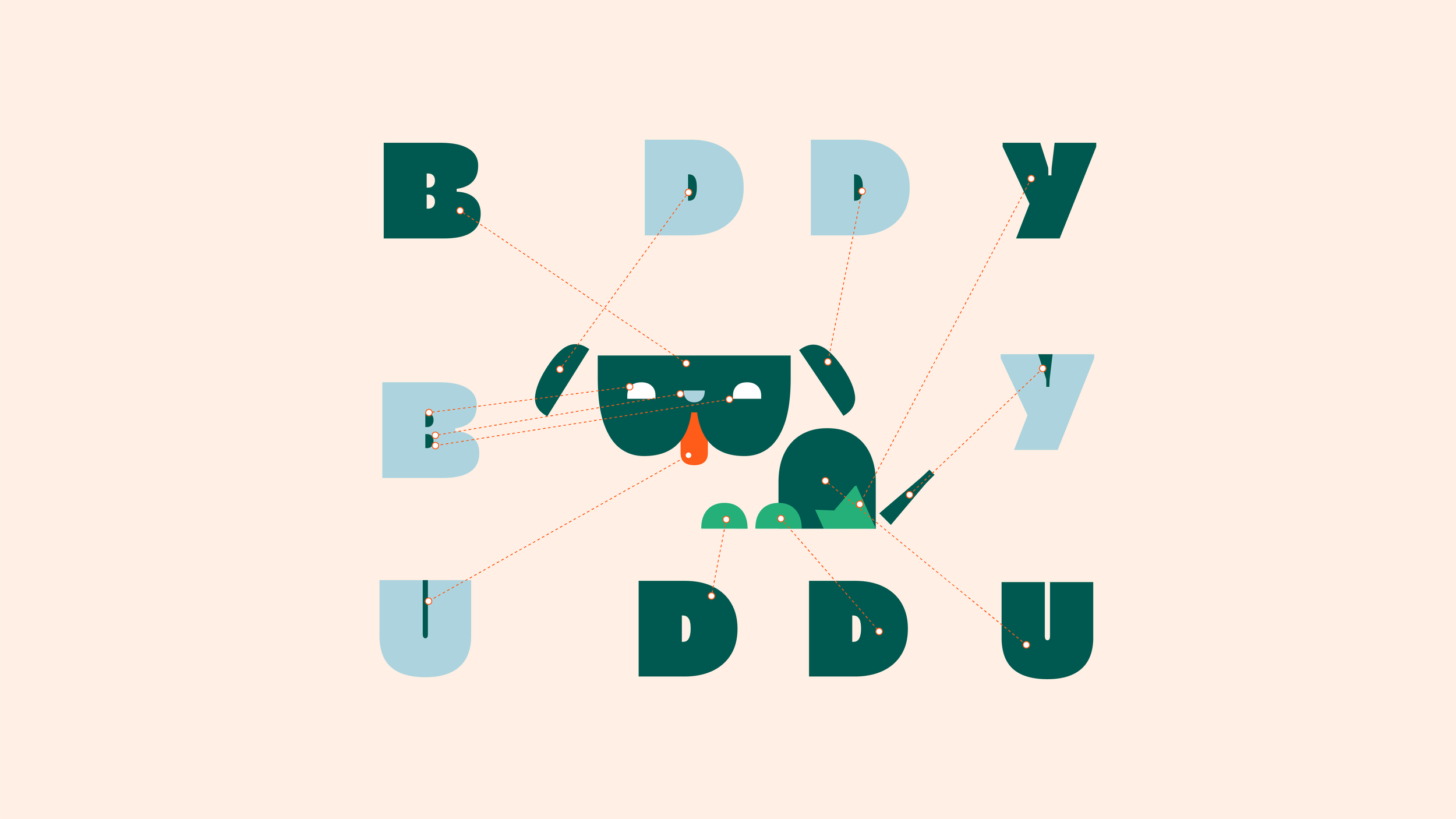
We also created a brand mascot: A scrappy little underdog called Buddy, made up of literal ‘scraps’ from the Buddy wordmark. Buddy’s expressiveness and versatility make him a valuable asset that lightens up both the brand and App experience. On top of that, we developed a brand pattern called the ‘scrap heap’—a jumble of pieces of the logo that we rolled out to create dynamic layouts for brand collateral.
The last piece of the puzzle was a confident, warm, and playful brand personality and tone of voice to complement the visuals and help add an extra bit of lightness into the world and work of scrappies.
Impact
All of this came together in a brand that stands out and stands apart. Buddy was a hit among scrappies when it launched, and the business continues to grow and build, making scrappies’ lives better by making trading scrap smoother, simpler, and generally just a bit more fun.
Team
Creative Director – Shannon Davis
Strategist – Jason Tuohy
Designer – William Rech
Animation – David Hillier
Project Manager – Naledi Mokhele


